How do you access the internet? The chances are, you use a smartphone as much, or even more than your PC or laptop. According to research, recent figures suggest that over 70% of users access the internet using a smartphone or tablet device, with only 8% using a desktop computer.
Whichever business sector, your customers are just as likely to look for your website when they are on the train, in the garden, or on the sofa as they are when they are sitting behind a desk.
But it is not just about giving your users a good experience when they visit your website using a mobile device, Google also uses mobile-friendliness as an SEO factor. The more friendly it is to use on your phone, the more visible it is likely to be on search engines.
So, if you want your website to work for you 24/7 and you want to improve your chances of ranking well in Google, it has to be mobile-friendly and work anywhere, any time, on any device.
A mobile-friendly website has been designed with both the desktop and mobile user in mind. Whether visitors are using a small mobile or a large desktop, if they are visiting a mobile-friendly website, they will still get a good viewing experience.
Find out if your website is mobile-friendly by using Google’s Mobile-Friendly Test tool.
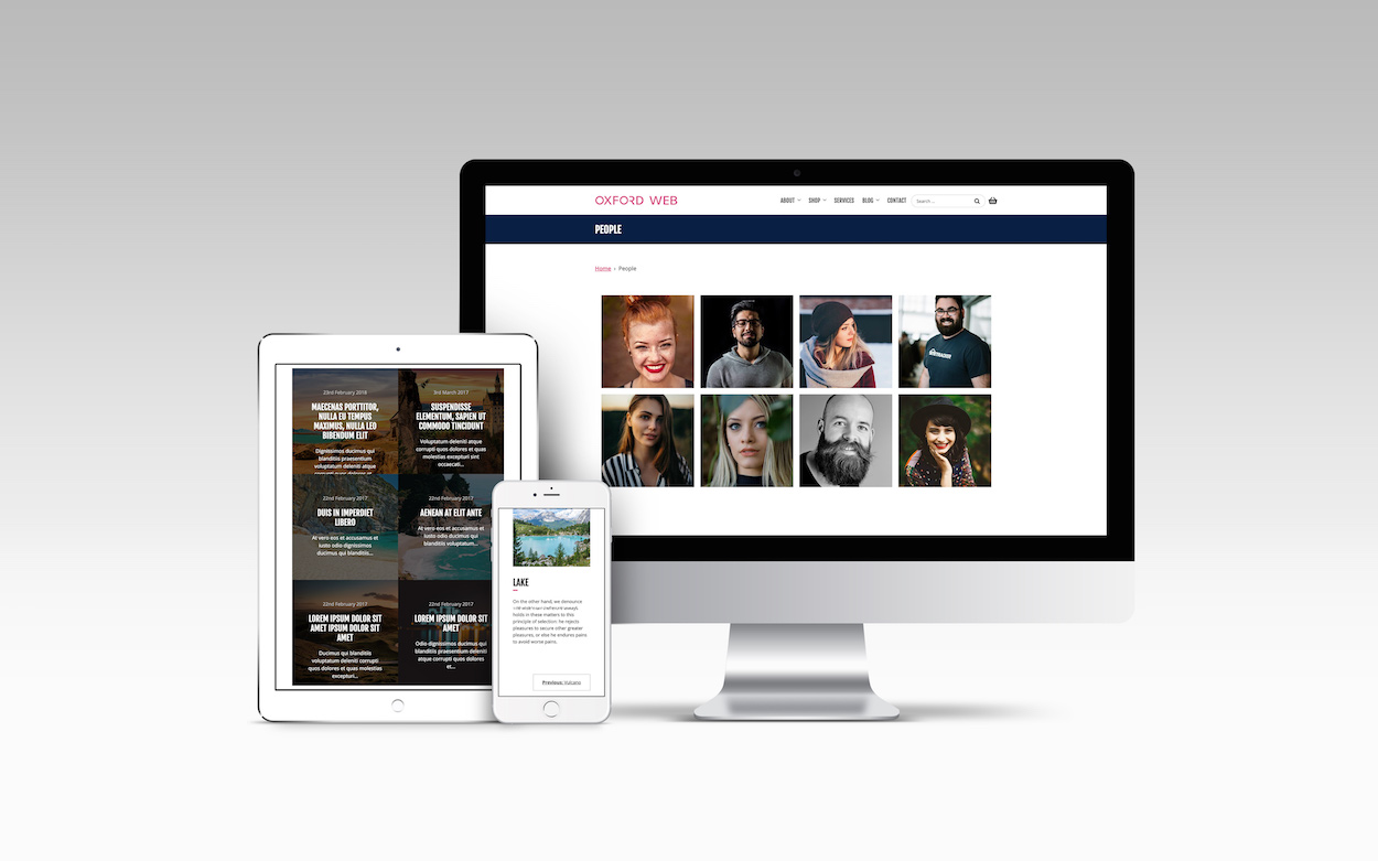
Responsive web design is the term used to describe websites that automatically adapt to fit the device it is being viewed on. Websites designed to be ‘responsive’ mean no matter the size device your customers are using to access your website – they will still get a good user experience and therefore a positive impression of your business.
Making your website responsive is an important first step in having a mobile-friendly website, but it isn’t the only criteria. You also have to consider the content – what works on a large desktop computer, may not work so well on a small smartphone.
Large images and videos may make your website look good, but they increase the download speed of a page. Pages that take a long time to load could result in your visitor leaving your website quickly. This is especially true when this content is being viewed on a smaller device. Our advice:
A responsive website, with well thought out content is important when designing a mobile-friendly website, but the user-experience is also a big consideration. Think smart when you are briefing or designing your website – make sure it will look good and work well on a smartphone but keep your layout simple.
All Oxford Web websites are built to be mobile-friendly as standard. Whether your visitors are using a phone, tablet or desktop computer, they will get the same quality user experience every time. This optimises their experience, making it more likely they will come back to your website or buy your products and services.
If you are looking for a simple marketing website or something more complex, like an eCommerce or events management website, we can help. Get in touch to start creating your attractive, easy to manage, secure website today.


